Your Klaviyo dashboard is lying to you (and it's costing you)
Open rate at 42%, revenue up, everything green. And yet, on most accounts we open, there's $5,000 to $20,000 a month missing. The problem isn't your numbers. It's the ones Klaviyo doesn't show you.
By Thibault
The “everything’s fine” dashboard trap
We open a Klaviyo account a week, on average. The story is almost always the same: decent open rate, revenue trending slightly up, a few flows running. On paper, nothing to flag.
Then we look at what the dashboard doesn’t show. And that’s where we find $5,000 to $20,000 in monthly revenue quietly evaporating.
The Klaviyo dashboard isn’t wrong. It’s incomplete by design: it shows you what happened, not what you’re missing. On more than 90% of accounts, we find the same four blind spots.
Blind spot #1: you’re watching open rate, not RPR
Since Apple Mail Privacy Protection, open rate is inflated and basically meaningless. The only number that actually matters is revenue per recipient (RPR): how much each email you send actually generates.
Klaviyo doesn’t surface it anywhere. The result: brands keep blasting 100% of their list because “the open rate looks good,” while their RPR collapses on cold segments, and their deliverability with it.
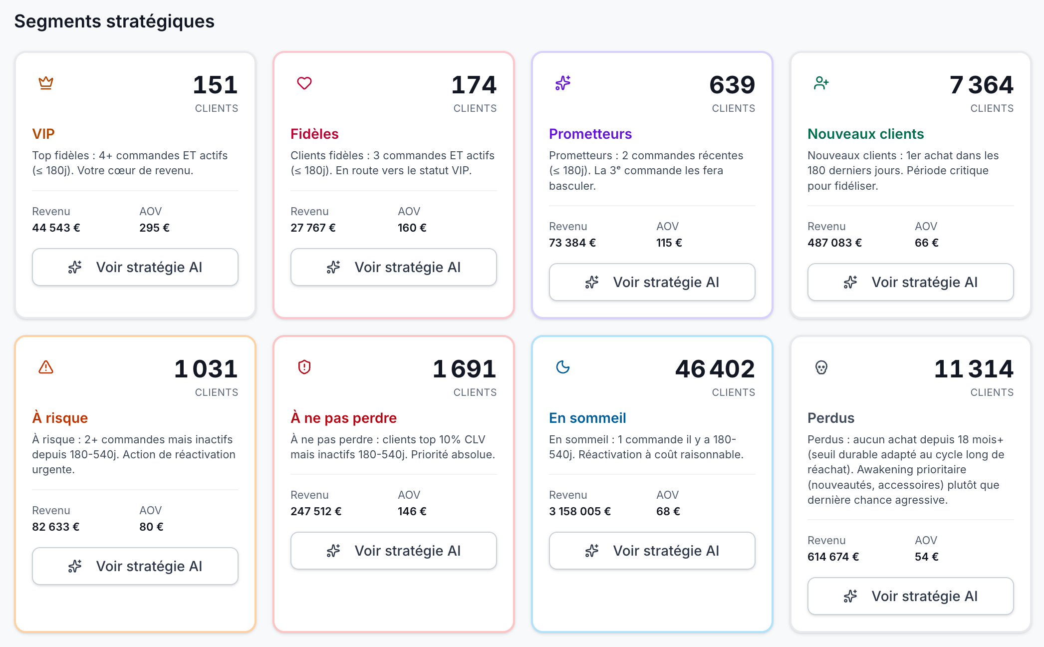
Blind spot #2: your VIPs leave without setting off any alarm
Your VIPs (6+ orders) make up 5 to 10% of your buyers but 30 to 50% of your revenue. When one of them stops buying, you lose the equivalent of 10 to 50 new customers.
The native dashboard doesn’t watch for that shift. A VIP slides from “active” to “at risk” without a single signal firing. Six months later, they’re gone, and nobody saw it coming.
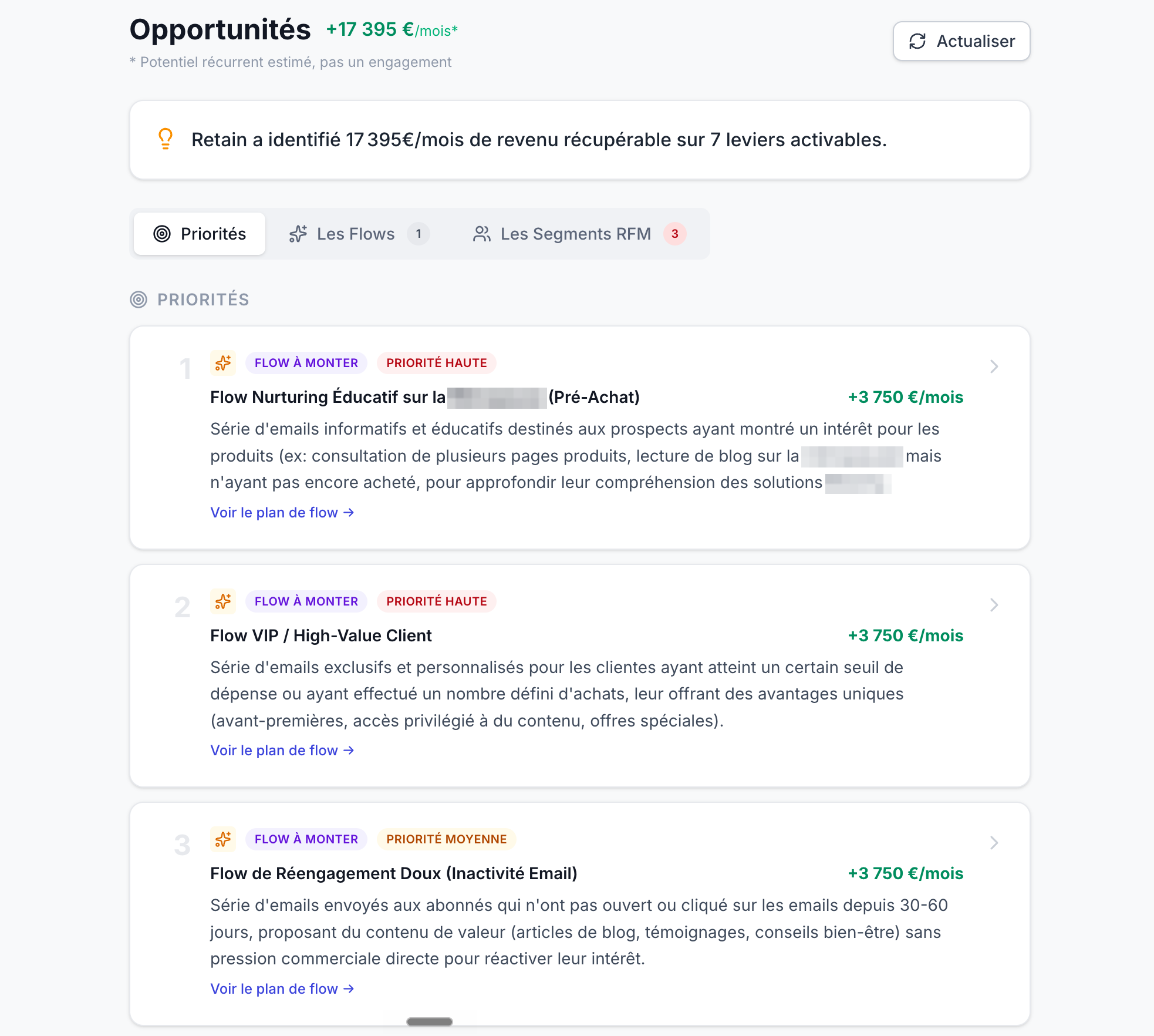
Blind spot #3: the flows you don’t have
Klaviyo shows you the performance of the flows you already have. It never tells you: “you’re missing a browse abandonment flow” or “your post-purchase stops at 2 emails when it should have 5.”
And that’s often where the biggest miss is hiding. A nonexistent browse abandonment is $500 to $3,000/month that simply doesn’t exist in your numbers, which makes it impossible to spot in a dashboard that only knows how to display what’s already running.
Blind spot #4: revenue drowning in the average
A campaign sent to your whole list shows a “decent” headline number. What the average hides: your best customers under-emailed, your prospects over-emailed, and deliverability slowly degrading.
The dashboard aggregates. And aggregation is exactly what makes a leak invisible.
The real number: how much you’re leaving on the table
When you add up the blind spots on a typical DTC account doing $1M to $15M in revenue, the math looks like this:
Typical money left on the table (DTC account, $1M to $15M)
| Métrique | Votre valeur | Seuil | Statut |
|---|---|---|---|
| 2nd purchase that never comes | $1,500 to $5,000 | /month | ! |
| VIPs leaving in silence | $1,000 to $4,000 | /month | ! |
| No browse abandonment flow | $500 to $3,000 | /month | ! |
| Deliverability eroding | $1,000 to $4,000 | /month | ! |
| Unsegmented campaigns | $800 to $3,000 | /month | ! |
Nothing theoretical here: it’s the sum of the leaks we see on most accounts, the ones your dashboard, by construction, can’t show.
How to see your own blind spots
You can hunt them down by hand: export your flows, cross-reference RPR by segment, model the missing flows, check revenue concentration. Plan for a solid day, and you’ll have to start over next month.
Or you connect Retain to your Klaviyo. In 5 minutes, you get your 4 blind spots priced in $/month, ranked by impact, with the concrete action for each. No credit card, no sales call.
Your dashboard tells you what happened. Retain tells you what you’re missing.
Guides connexes
Untapped CRM revenue: how much are you leaving on the table?
The complete guide to identifying your revenue leaks.
CRM RevenueRPR: the KPI nobody tracks
Why revenue per recipient beats every other KPI.
The Lab+38% Klaviyo revenue in 90 days: the 3 levers
The edition where we price out the levers, one by one.